
Case Study
Services

Sip, Dip, & Smile was a 2021 campaign from the Campbell Soup Company that paired three of its brands, Campbell's Tomato Soup, Goldfish crackers and Pepperidge Farm Farmhouse Hearty White Bread, as the classic lunchtime combo. The campaign ran on Tastemade with recipe videos and posts from Tastemade creators, all built around tomato soup and grilled cheese.
Sip, Dip, & Smile brought together three Campbell Soup Company brands around a single idea: tomato soup, grilled cheese and Goldfish crackers make the perfect lunch. The campaign was built on short recipe videos, so it needed a home on the web where people could watch them, cook along and pick up the ingredients.
The site had to live on a Tastemade subdomain and look like it belonged there, with Tastemade's header, navigation and footer, while still giving the campaign its own identity. It also had to bring the recipes, videos and creator content together in a way that was quick to browse on any screen.
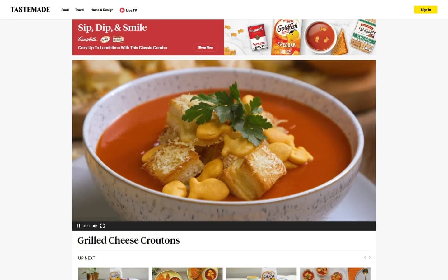
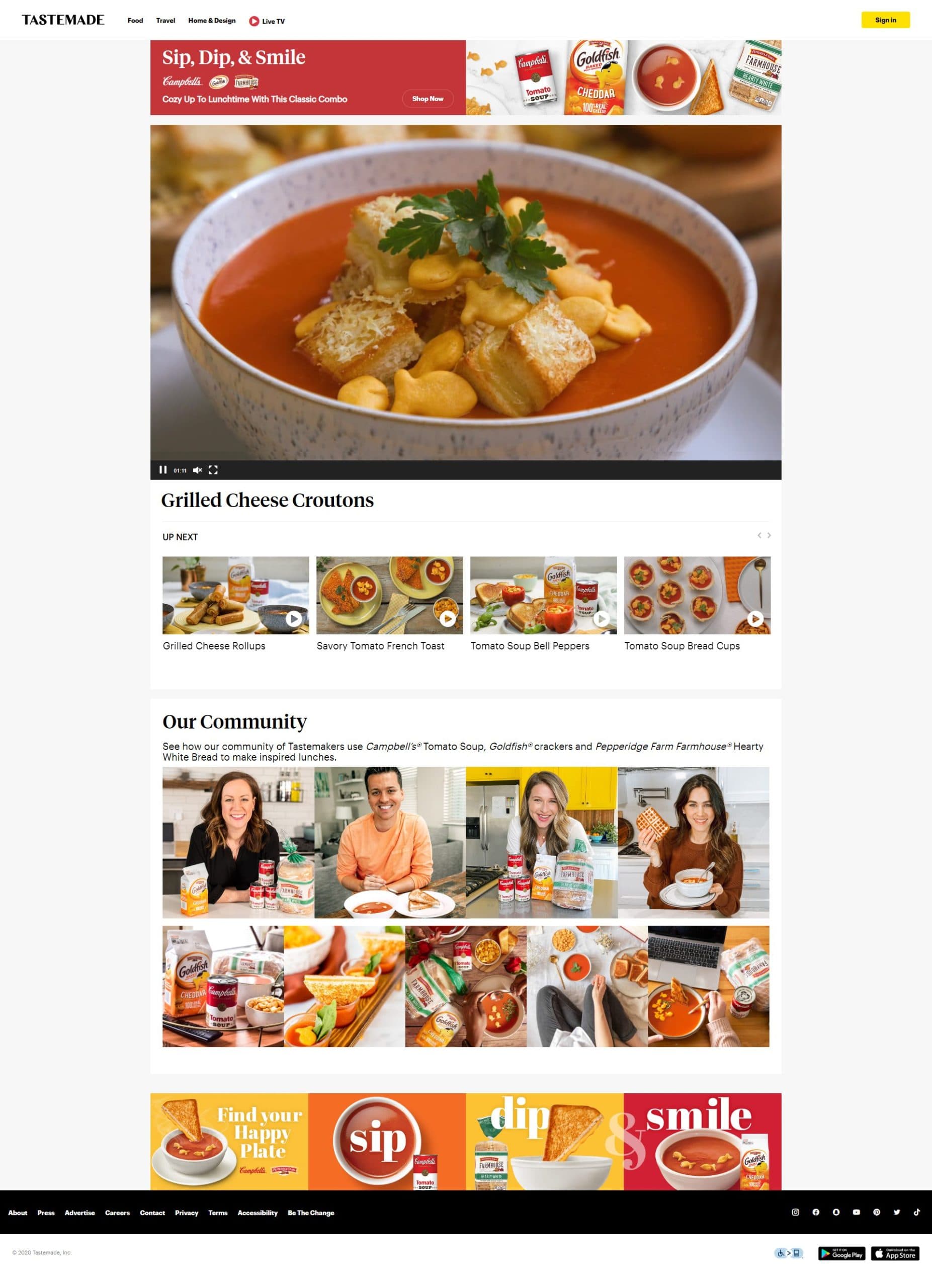
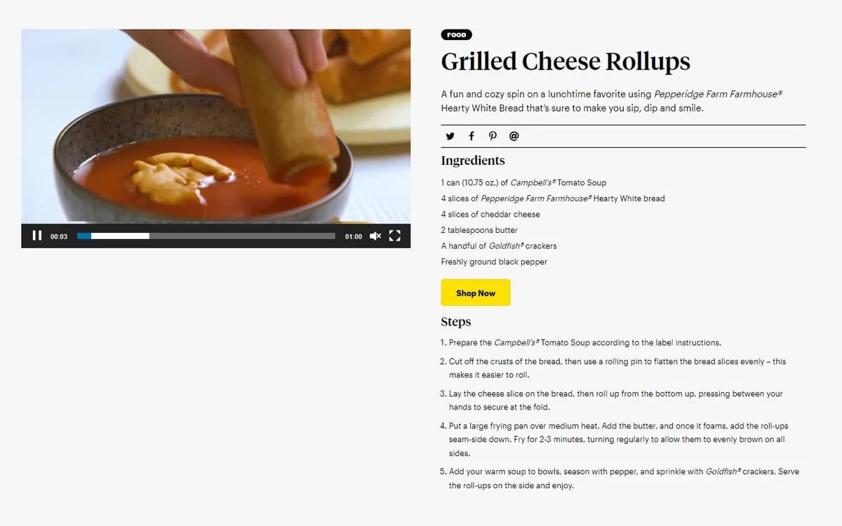
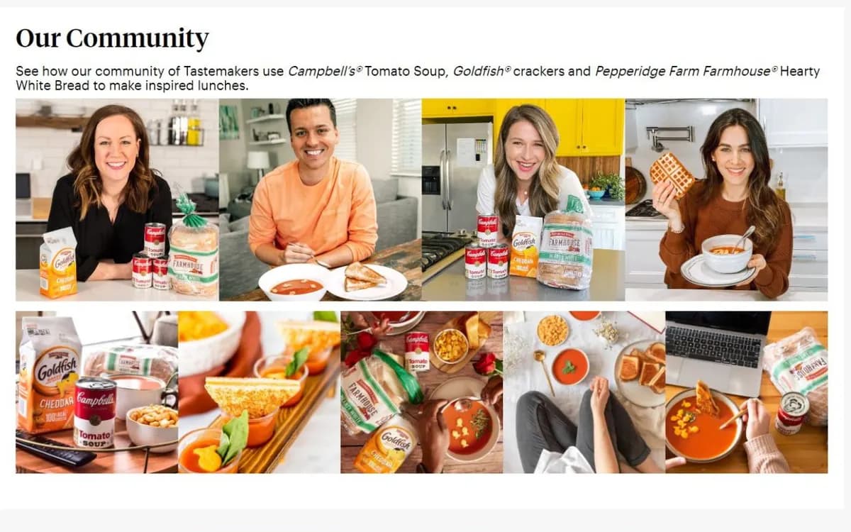
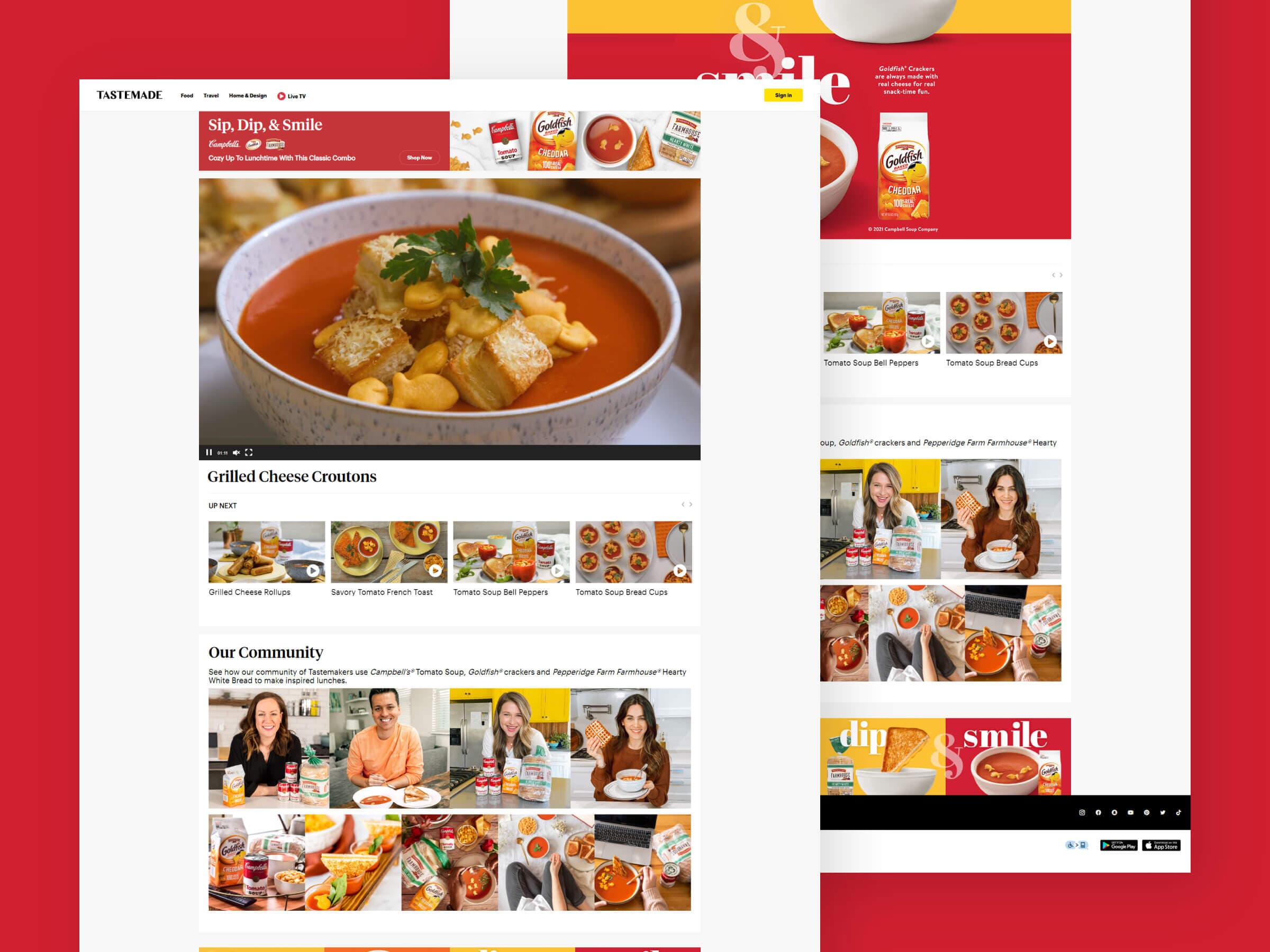
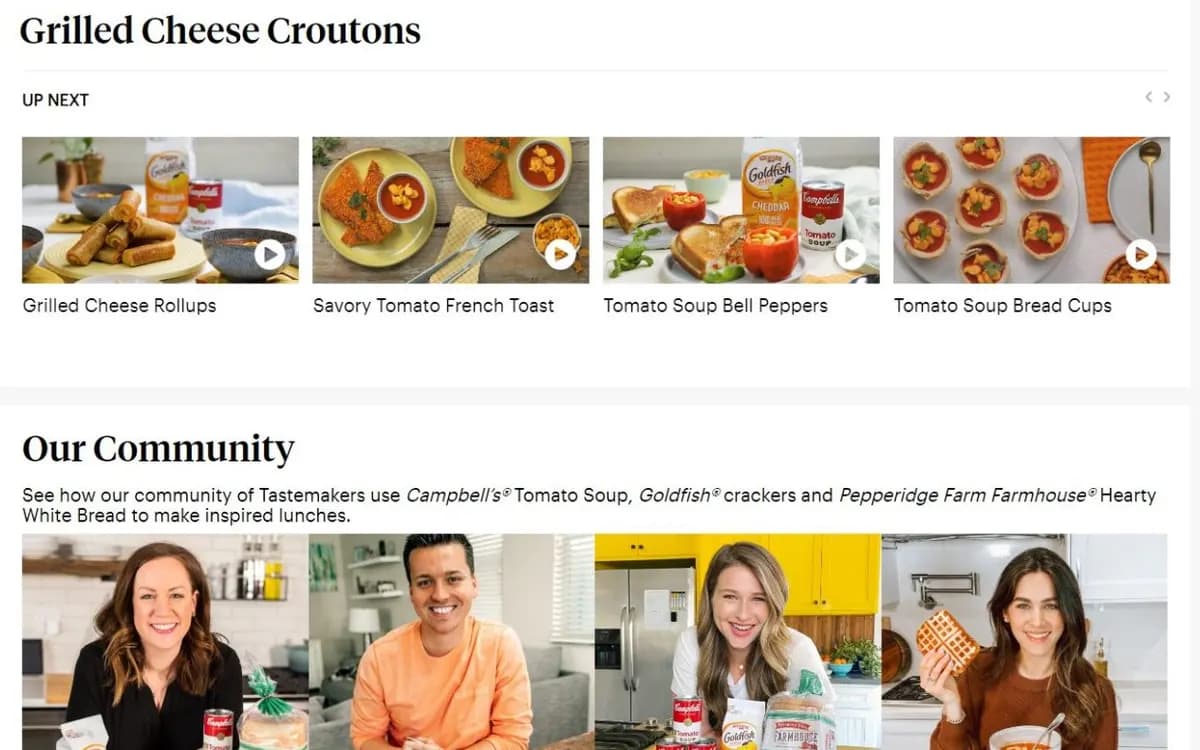
We kept the page design simple and built it around video. The home page opened with a Sip, Dip, & Smile banner and a featured recipe video, followed by an Up Next carousel of the other recipes and a gallery of Tastemaker creators. Each recipe had its own page with the video, ingredients, numbered steps and a Shop Now button.
We built the site on WordPress with a custom theme that matched Tastemade's typography and layout, and set up recipes as their own post type so each dish could be added with its video, ingredients and steps in one place. The campaign's red and gold artwork closed out the home page in a full-width banner above the footer.
The site turned a lunchtime campaign into something people could watch and cook. Choose a feature to see how it looked.
Under the featured video, an Up Next carousel lined up the rest of the recipes, from Grilled Cheese Rollups and Savory Tomato French Toast to Tomato Soup Bread Cups and Tomato Soup Arancini. Each card showed a still from the video with a play button, so visitors could keep watching from one dish to the next.
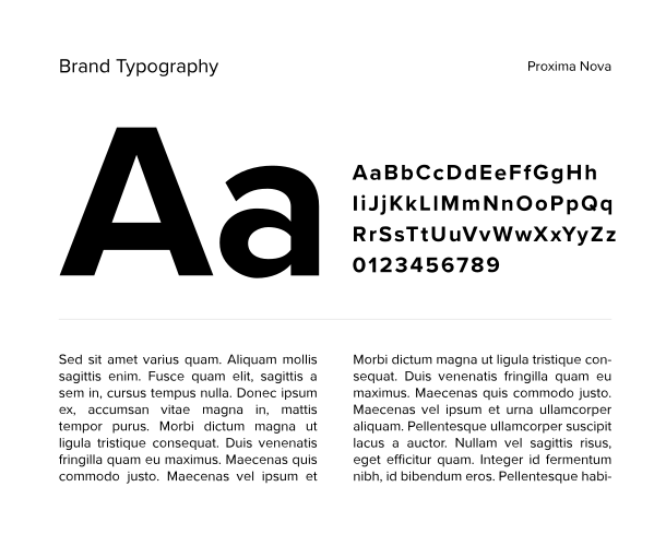
The site used Tastemade's header, footer, typography and layout, so it felt like part of the publisher's own platform rather than an ad. Campaign branding stayed in the banner and the closing artwork, where it framed the content without crowding it.
Each recipe page and the home page put a video at the top, which suited a campaign built on short cooking clips. Visitors could go from one recipe to the next through the carousel without hunting through menus.
Shop Now buttons in the campaign banner and on every recipe page gave interested cooks a direct route to the soup, crackers and bread used in each dish.
Because recipes were their own post type in WordPress, adding a dish meant filling in its video, ingredients and steps in one place. That kept every recipe page consistent and made the full set practical to publish for the campaign.
Tell us where you want your business to go. A senior member of our team will get back to you right away.