

Case Study
Services
Premiere Baby Imaging is an elective ultrasound studio in Denison, Texas. It offers 3D, 4D and HD ultrasounds, the SneakPeek early gender blood test, and private baby showers and gender reveal parties, giving expectant families their first look at their baby's face along with prints to take home.

Premiere Baby Imaging offers one of the most emotional experiences an expectant family can have: seeing their baby's face for the first time. Their brand didn't quite say that yet. The old identity was a bright blue-and-pink heart mark, and the website leaned on stacked menus like "Patient Concierge" and "Why Choose Us?" that made visitors hunt for the basics.
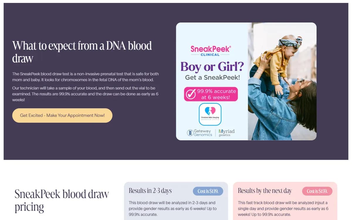
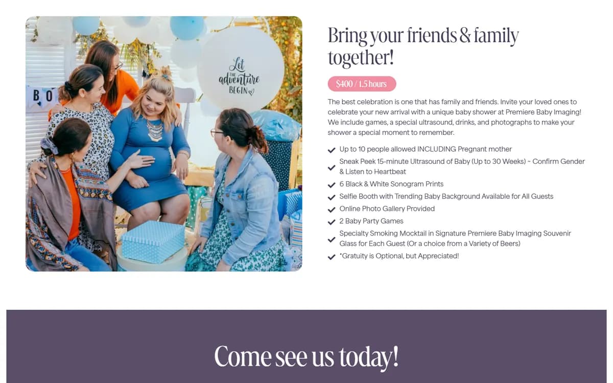
Those basics matter a lot here. Parents want to know which scan suits their stage of pregnancy, what it costs, how early they can learn the gender and how to book. The studio also had more to offer than ultrasounds, from the SneakPeek gender blood test to private baby showers and an in-house boutique, and all of it needed a clear place on the site.
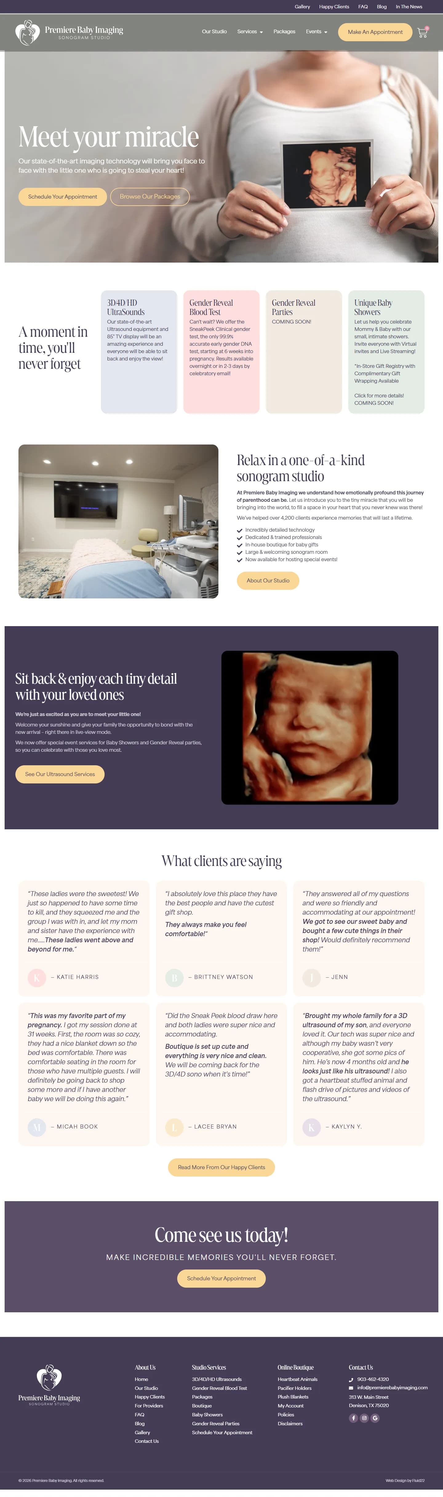
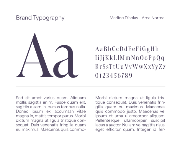
We began with the brand. A new logo, a line drawing of a mother and child inside a heart, sets the tone, and a soft palette of deep plum, warm gold, blush and sage carries it across every page alongside an elegant serif for headlines. The result feels calm, warm and a little luxurious, much like the studio itself.
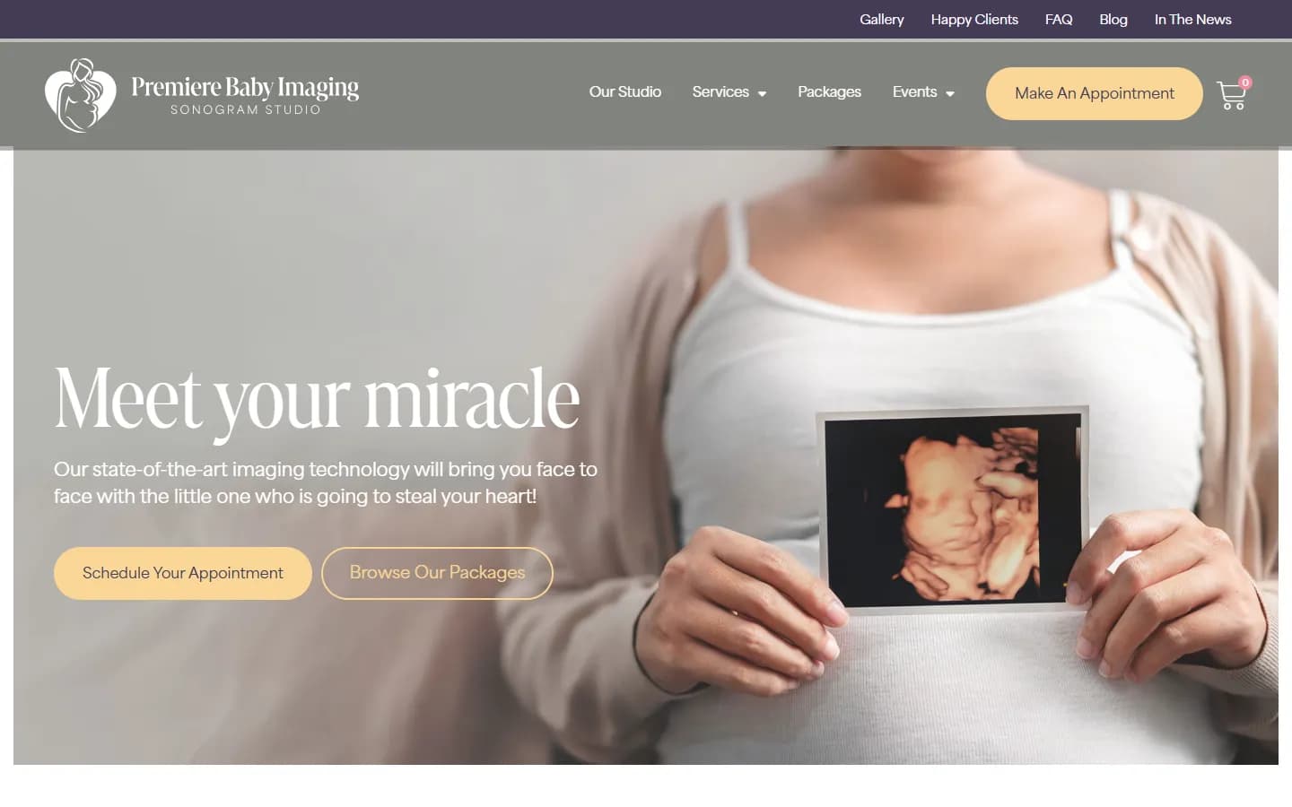
Then we rebuilt the website on WordPress and Elementor, with WooCommerce for the boutique, and organized it around the questions parents actually ask. Services, packages and events each have their own section, plain-language explanations sit next to real sample images, and an appointment button is always in reach, so getting from curious to booked takes only a few clicks. We wrote the site copy too, keeping the tone as gentle and excited as the team that greets families at the door.
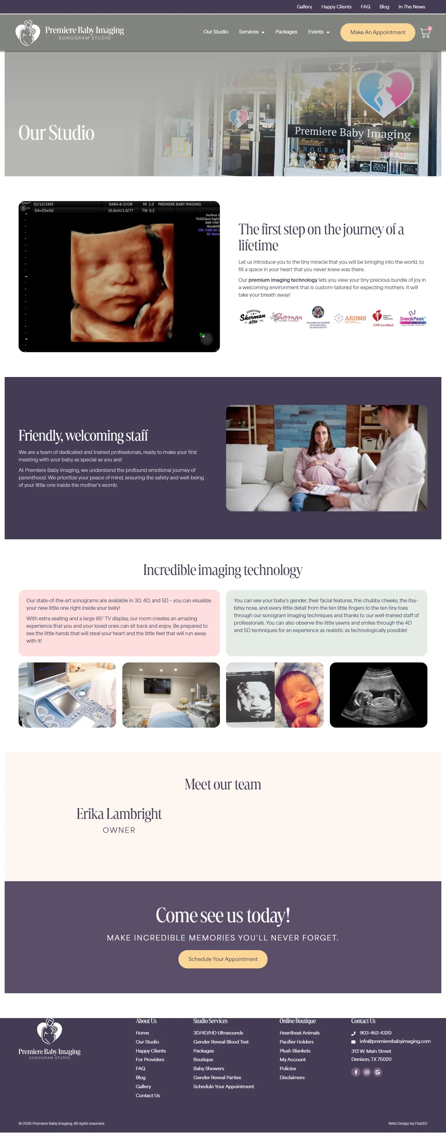
Every page is built to help expectant parents choose and book with confidence. Choose a feature to see it on the live site.
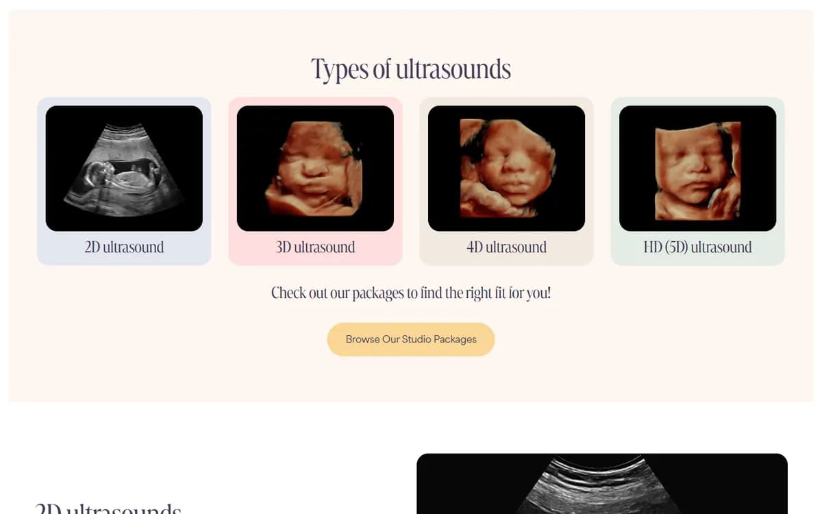
The 3D/4D/HD Ultrasounds page walks parents through 2D, 3D, 4D and HD (5D) scans one by one. Each type is described in plain language and paired with real sample images or video, so families can see the difference before they book.
The new logo, palette and typography give Premiere Baby Imaging an identity as tender as the experience it offers. It carries consistently across every page, from the homepage to the package guides.
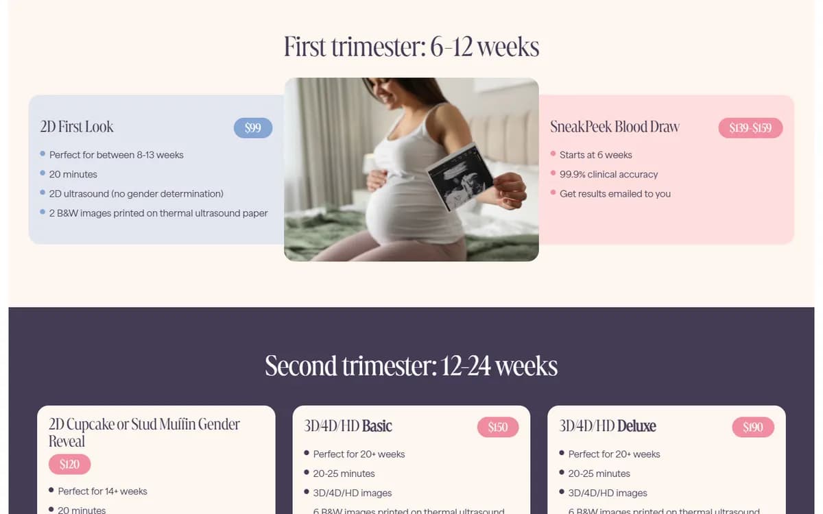
Organizing packages by trimester and explaining each scan type in plain language takes the guesswork out of choosing. Parents can compare prices and inclusions on their own and arrive at their appointment knowing what to expect.
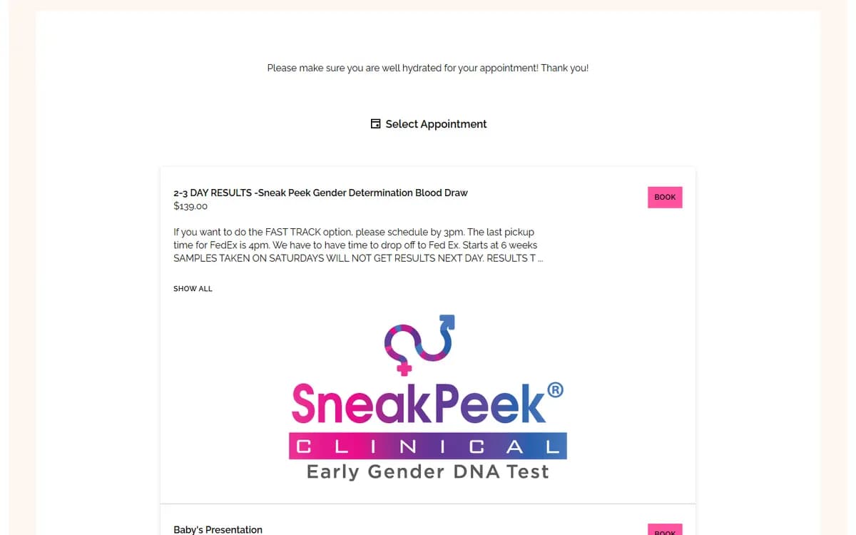
With online scheduling built into the site and an appointment button on every page, families can book a scan or blood draw whenever it suits them. That means fewer phone calls for the team and less waiting for excited parents.
Built on WordPress and Elementor, the site lets the team adjust prices, add services and publish news on their own. New offerings like baby showers and gender reveal parties slot neatly into the existing Events section.
Tell us where you want your business to go. A senior member of our team will get back to you right away.